Joya Sushi
Spec Work
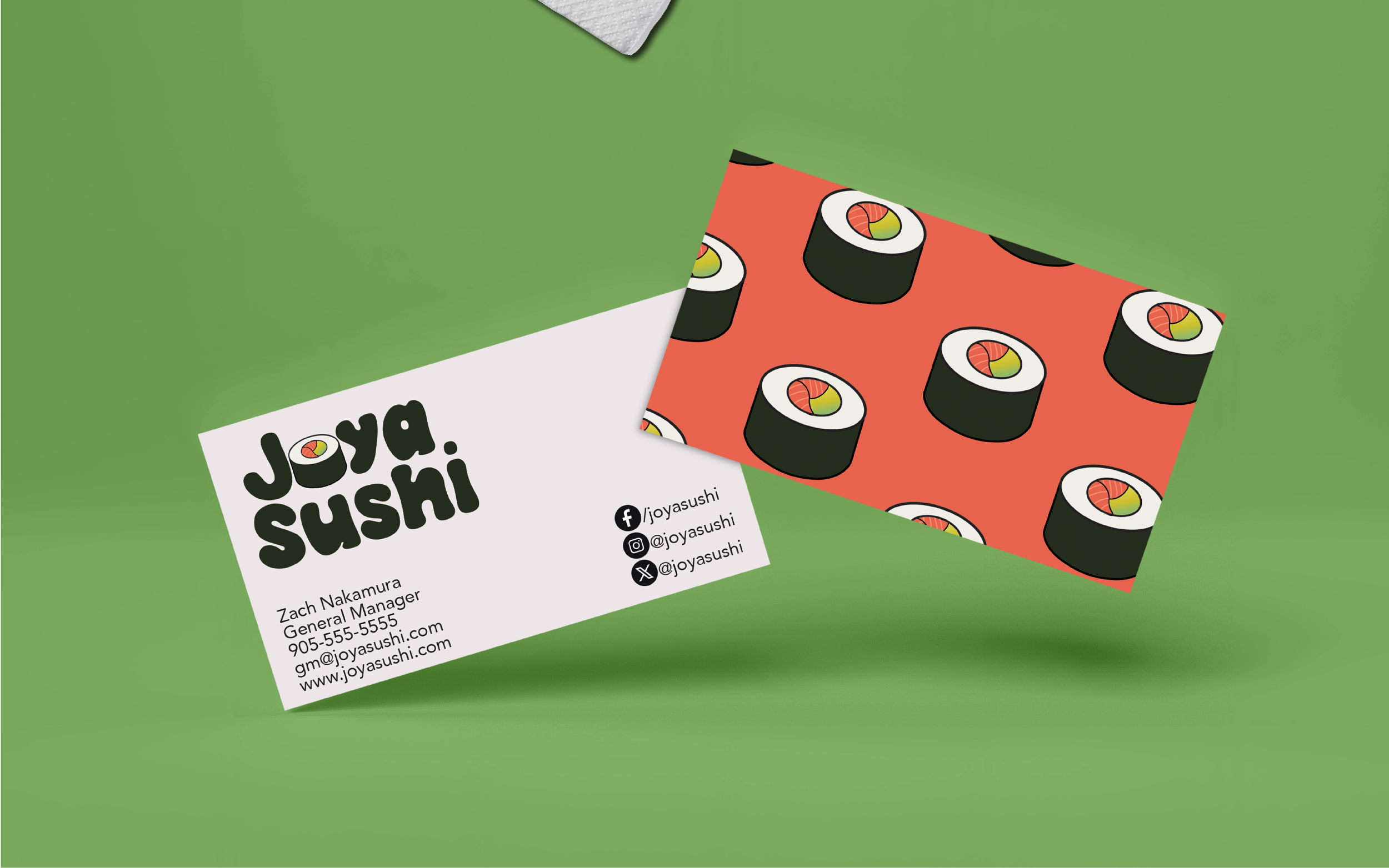
Joya Sushi is a Japanese-Korean restaurant offering playful flavours and creative sushi delights. This restaurant prides itself on simplicity and fun with a whimsical nature - expressed in the themes found in its brand identity.
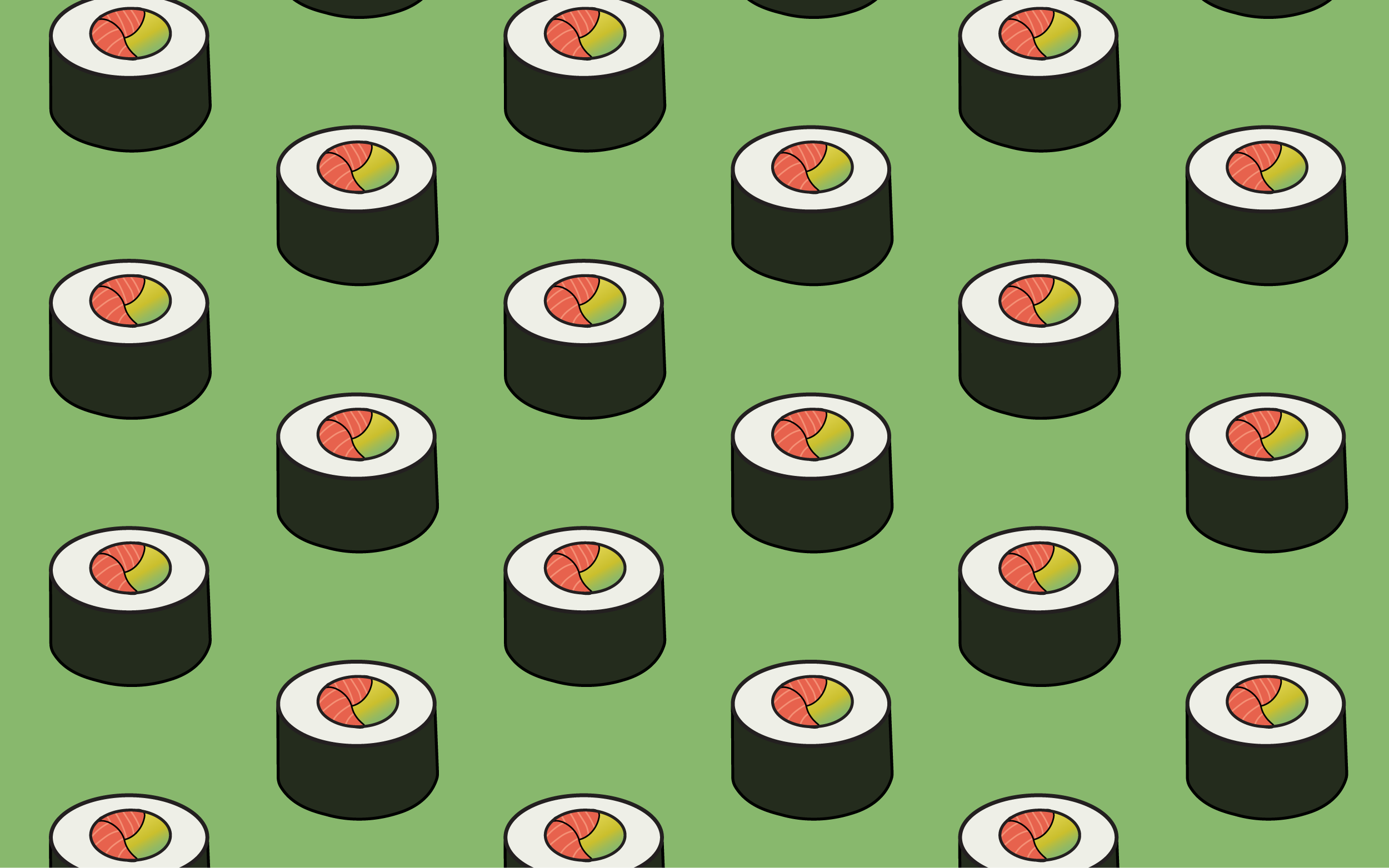
My goal was to find a playful display font to pair with a fun icon. The typeface Lucky Coin fit this brand beautifully, with bold and fun curvy-shaped characters. I drew on familiar colours associated with sushi to develop the colour palette, bright shades of salmony-orange and green reminiscent of avocado paired with a dark green-black that mimics the colour of nori. I wanted to ensure the elements of the brand could be used in a variety of applications, as Joya Sushi is a dine-in restaurant that also boasts a broad take-out menu. This fresh look for Joya Sushi maintains the fun and simplistic atmosphere that is at the core of their brand.


